A New Era for the Grid: Instagram’s Shift from 1:1 to 4:5
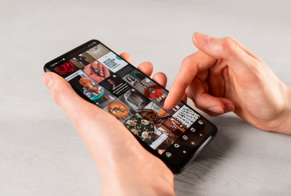
Instagram has always been that visually driven playground where first impressions matter—big time. So, when Instagram quietly decided to let go of its signature 1:1 grid in favor of taller 4:5 posts, eyebrows rose around the world.
Instagram has always been that visually driven playground where first impressions matter—big time. From hyper-curated feeds to polished Reels, this platform is all about visuals that leap off the screen and into your audience’s heart. So, when Instagram quietly decided to let go of its signature 1:1 grid in favor of taller 4:5 posts, eyebrows rose around the world. If you’ve found yourself wondering how this pivot might affect your carefully planned posts—or if it will alter your entire workflow—let’s dive in together.
Why the Switch to 4:5?
For ages, the square (1:1) was the timeless Instagram staple. But times change, and so do user habits. Over the last couple of years, vertical content has been on the rise. We’ve seen it blow up on TikTok, then creep into Instagram’s Reels and Stories. It’s quicker to grab attention on our always-scrolling phones, and it uses more screen space (all the better to captivate those wandering thumbs).
The switch to 4:5 is a natural evolution. By moving away from a strict square format, Instagram can highlight vertical visuals that feel more immersive. More screen real estate means more storytelling power, better chances to pop in the feed, and a more streamlined look across the app’s many features.
What Does This Mean for Creators and Brands?
Vertical Emphasis: Let’s start with the obvious—tall posts stand out. When your photo or graphic is taller, it holds more scroll-stopping potential. It instantly commands attention as users swipe through the feed.
Bolder Composition: One of the exciting parts of this change is the chance to experiment with composition. You can fit more story into each frame—more background details, longer text overlays, or a bigger portion of that gorgeous landscape.
Smoother Multi-Platform Sharing: If you’re someone who also creates TikTok or Reels content, you may already be used to shooting vertical video. Now, you can keep the same orientation and maintain consistency across different platforms without chopping and cropping.
Potential Workflow Tweak: With 1:1, you might have gotten into a comfortable habit—maybe your personal presets and templates are all laid out for square images. Now, you’ll want to rework templates, adjust aspect ratios in your design software, and generally shake up your visual planning.
Varied Aesthetic: For some brands, the square grid was almost sacred. Going taller might feel disruptive at first. But think of it as creative freedom. You still can post squares or even landscape images—but sprinkling in 4:5 posts can give your feed more variety and dimension.
Actionable Tips to Master the 4:5 Format
1. Plan Your Composition Strategically
Rule of Thirds, Reimagined: If you’re taking photos on your phone, switch on the grid lines and consider how the top third of your shot can really grab attention. Whether it’s an eye-level subject or your brand logo, position it where it’ll stand out as users scroll.
More Space for Text Overlays: Planning text overlays? Now you have room to add short punchy captions without crowding your subject. Just be sure to keep crucial text away from the edges, where it might get cropped by Instagram’s feed preview.
2. Adapt Your Editing Templates
Design Software Adjustments: Update your dimensions in tools like Canva or Photoshop. Some typical vertical templates (like 1080x1350 pixels) match the 4:5 ratio perfectly.
Batch Adjust Past Content: If you have evergreen content that performed well and want to repost it in the new format, consider re-cropping or re-editing to fit 4:5 to keep a polished look.
3. Mind the Profile Grid Preview
Check the Crops: Even though your post can be 4:5, the main grid preview might still show a centered square cut. Always preview your images in a crop tool to confirm that nothing vital (like a face or text) gets lost in the automatic trimming.
Feed Consistency: If you have a specific feed aesthetic—like color-coordinated frames—you might decide to create a white or branded border for consistency. That way your main subject still shows up centered, but you can maintain an overall cohesive grid.
4. Embrace Storytelling
Sequential Storytelling: Use carousels! The extra height can give each panel more impact. Telling a step-by-step story or presenting a product’s features becomes even more visually engaging.
Capture Behind the Scenes: Show more of the context or environment—your workspace, the background vibe at a photoshoot, or the setting behind an event. Use that vertical space to draw viewers into the moment.
5. Test, Analyze, and Adjust
Insights Over Assumptions: Don’t just assume every vertical post will automatically do better. Keep an eye on your metrics—like impressions, saves, and shares—and compare them with your previous 1:1 content.
Listen to Your Audience: If you notice that a certain style of vertical shot resonates more, double down on that approach. You might discover sweet spots—maybe your audience loves bold text at the top or cinematic portrait shots with subtle text at the bottom.
Looking Ahead: How to Future-Proof Your Instagram Strategy
Instagram’s pivot to 4:5 is a reminder that social platforms—and our tastes—are always in motion. Rather than seeing each update as an inconvenience, think of it as a fresh invitation. After all, the best marketing strategies are flexible. By adding new creative angles, adjusting templates, and refreshing your feed aesthetic, you stay on top of trends and set yourself apart in a crowded space.
Still, don’t feel pressured to post only vertical images. Authenticity trumps any single format. If a square post or a landscape shot adds flavor to your feed, absolutely go for it. The key is balance. Always bring value to your audience—whether that’s through an interesting story, a compelling design, or a quick-hitting tip that simplifies their life.
With this new era, Instagram wants us to go big and bold. Take advantage of that vertical space. Take chances with your composition. And above all, keep delivering content that stays true to your brand’s unique flair and vision.